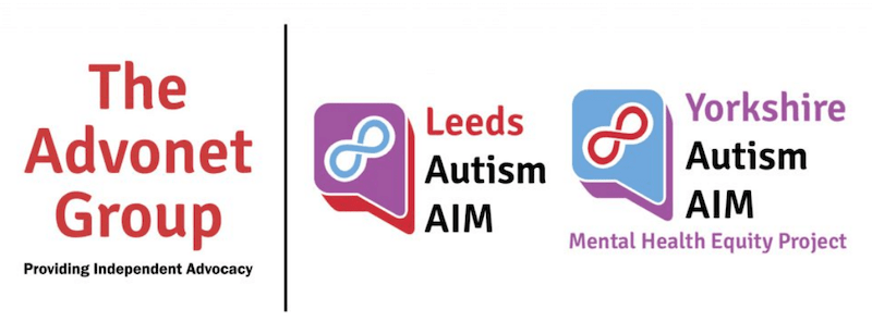
After getting feedback from team members, the project’s steering group and its’ Coproduction Group, Leeds Autism AIM and our new Yorkshire Autism AIM – Mental Health Equity Project (YAAMHEP) have new logos! Funded by a grant from Comic Relief’s Change Makers fund, YAAMHEP aims to improve access to mental health services for autistic adults in West Yorkshire.
YAAMHEP’s logo uses slightly different colours to the AIM one. It uses the same font and also has a 3D speech bubble with an infinity symbol. This is to reflect the fact that YAAMHEP is working parallel to Leeds Autism AIM and that both are part of The Advonet Group.
Infinity symbol
Both logos have two key features. The first is an infinity symbol – this is used by the wider neurodiversity movement as an alternative to others used to denote autism.
These include the jigsaw piece, which is seen by some as controversial for two reasons. Firstly, it may suggest that autistic people are a ‘puzzle’ to be worked out. Secondly, it is used by some organisations who aim to ‘cure’ autism, putting them at odds with many autistic people’s views.
The second feature is the speech bubble. This denotes advocacy and the idea that both services are about making sure autistic people have a voice and that it is heard. Both Leeds Autism AIM and YAAMHEP are run on advocacy principles.
Branding questions
Both logos will be featuring on all the respective projects’ publicity material. If you have any questions about branding for either or both projects, please email Luke Aylward, Communications and Network Officer and Information Officer for AIM and YAAMHEP at [email protected].